4. Widgets walkthrough.
Below are some examples of how to use the basic widgets (per type).
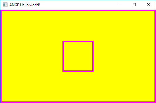
Background
Widget, that displays a solid color area.
#include "Ange.h"
using namespace Ange;

int main()
{
	//Create window
	Window window(nullptr,"ANGE Hello world!",
		{ {300,200}, {500,300}, WindowFlags::ChildAutoOperate | WindowFlags::AutoInvokeRender | WindowFlags::FifoDrawable });
	window.Init();
	window.SetClearColor(Color{ 230,233,240,255 });

	//Create our own theme (you can also use DefTheme)
	//						   Main Color	Border Color  Border Size
	BackgroundTheme theme{ {255,255,0,255}, {255,0,255,255}, {4,4} };

	//Create Background widget that covers entire window
	Background bg(&window, { {0,0}, {0,0}, Anchor::Left|Anchor::Bottom|ResizePolicy::AutoFill}, theme);

	//Create Background widget in the middle of the window with fixed dimensions
	Background bg2(
		&window,
		{{(int)window.GetDimension().tWidth/2,(int)window.GetDimension().tHeight/2}, {100,100}, Anchor::HorizontalCenter | Anchor::VerticalCenter},
		theme
	);

	//Add this if you want the second background to maintain position while resizing window.
	//Value "50" means: "Change position in the ratio of 50% to the window resize values."
	//For example if window is 500px wide and we resize it to 700px, then 'bg2' will add 100px
	//to its base position.
	bg2.SetResizeProportions(50, 50, 0, 0);

	//Main loop
	while (window.Operate()){window.ClearScene();}

	return 0;
}
We can also render widgets in explicit mode:
#include "Ange.h"
using namespace Ange;

int main()
{
	//Create window
	Window window(nullptr,"ANGE Hello world!",
		{ {300,200}, {500,300}, WindowFlags::ChildAutoOperate | WindowFlags::AutoInvokeRender | WindowFlags::FifoDrawable });
	window.Init();
	window.SetClearColor(Color{ 230,233,240,255 });

	BackgroundTheme theme{ {255,255,0,255}, {255,0,255,255}, {4,4} };

	Background bg2(
		&window,
		{{(int)window.GetDimension().tWidth/2,(int)window.GetDimension().tHeight/2}, {100,100}, Anchor::HorizontalCenter | Anchor::VerticalCenter},
		theme
	);
	bg2.SetResizeProportions(50, 50, 0, 0);

	//Main loop
	while (window.Operate()){
		bg2.Render(); //Here
		window.ClearScene();
	}

	return 0;
}
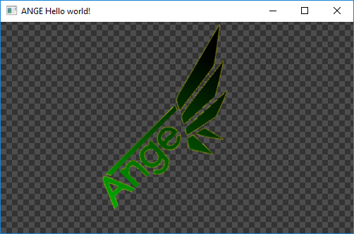
Image
Widget that displays an image.
Texture texture1("Graphics/transparency.png");
Texture texture2("Graphics/ange.png");
	//Create Image Widget (auto-detect texture size, fill window by this image, dont stretch -> repeat image)
	Image imageBackground(
		&window,
		{ {0, 0}, {0, 0}, ImageFlags::DetectSize | ImageFlags::Repeat | ResizePolicy::AutoFill | Anchor::Left | Anchor::Bottom },
		ImageTheme(),
		&texture1
	);
	imageBackground.SetColor({128, 128, 128, 255});

	//Create Image Widget (auto-detect texture size)
	Image image(
		&window,
		{ {250, 150}, {0, 0}, ImageFlags::DetectSize | Anchor::VerticalCenter | Anchor::HorizontalCenter },
		ImageTheme(),
		&texture2
	);
	//Filter-out blue component from image.
	image.SetColor({ 255,255,0,255 });
	//Rotate image by 45 degrees.
	image.SetRotation(45.0f);
| Texture1 |  |
| Texture2 |  |
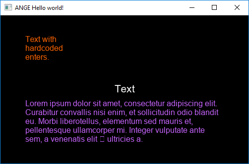
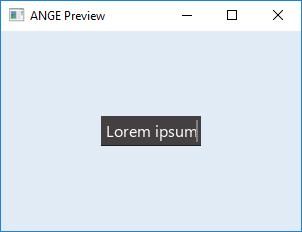
Text
Widget that displays text.
Font font("arial.ttf");
Theme theme = DefTheme; //Use default theme
theme.AssignFontToAll(&font);
	//Normal text
	Text text(&window, { {250, 150}, {400, (size_t)font.GetLineHeight(16)}, Anchor::VerticalCenter | Anchor::HorizontalCenter }, theme, L"Text");

	//Multiline text (no enters "\n" in text)
	Text multiline(
		&window,
		{ {50, 120}, {400, (size_t)font.GetLineHeight(12)*5}, Anchor::Left | Anchor::VerticalCenter | TextFlags::Multiline },
		{ 12, {200,100,255,255}, &font },
		L"Lorem ipsum dolor sit amet, consectetur adipiscing elit. Curabitur convallis nisi enim, et sollicitudin odio blandit eu. Morbi libero\
tellus, elementum sed mauris et, pellentesque ullamcorper mi. Integer vulputate ante sem, a venenatis elit \n ultricies a."
	);

	//Multiline text with explicit enters
	Text enters(
		&window,
		{ {50, 250}, {400, (size_t)font.GetLineHeight(12)*3}, Anchor::Left | Anchor::VerticalCenter | TextFlags::EnableNewlineChar },
		{ 12, {255,100,0,255}, &font },
		L"Text with \nhardcoded \nenters."
	);
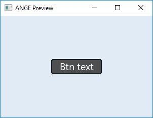
SimpleButton
Widget that displays button. There are two versions of this widget - one of them uses the "Background" basic widget to compose the widget look while the other uses "Image".
When creating an object of this type, you simply need to specify one of those widgets as the template parameter.
SimpleButton widgets can interact with your program via Callbacks or by polling methods (examples below).
SimpleButton<Background> button(window, {{0,0}, {100, 30}}, theme, L"Btn text");
//...or...
SimpleButton<Image> button(window, {{0,0}, {100, 30}}, theme, L"Btn text", &image);
button.SetCallback([&window](Event* ev)->bool{ //We can capture everything - callbacks are C++ style, not C.
	//Handle only MouseClick event for now.
	if(ev->GetEventType() == EventType::MouseClick){
		//Do some 'work' on button release when using left mouse button
		MouseClickEvent* mce = (MouseClickEvent*)ev;
		if(mce->GetAction() == 0 && mce->GetButton() == 0){
			window->Close();
		}
		return true; //Discard Event in this subwindow unit.
	}
	return false; //Event was not handled by us (the widget). The event will be send to the next widget which meets the requirements.
});
Window* window;

bool CloseWindowFunc(Event* ev){
	//Handle only MouseClick event for now.
	if(ev->GetEventType() == EventType::MouseClick){
		//Do some 'work' on button release when using left mouse button
		MouseClickEvent* mce = (MouseClickEvent*)ev;
		if(mce->GetAction() == 0 && mce->GetButton() == 0){
			if(window != nullptr) window->Close();
		}
		return true; //Discard Event in this subwindow unit.
	}
	return false; //Event was not handled by us (the widget). The event will be send to the next widget which meets the requirements.
}

...

//Note that if you want to pass some more data (not only the event), you need to subclass particular Event and add data to it / create new event type.
button.SetCallback(CloseWindowFunc);
while(window->Operate()){

	if(button.GetState() == 1 && button.GetAction() == 1){
		//Do our thing
		window->Close();
	}

	window->ClearScene();
}
SimpleInput
Widget that displays input field. It can interact with your program via Callbacks or by polling methods. You can also setup some filter functions (example below).
SimpleInput input(window, {{0,0}, {100, 30}}, theme);
input.SetFilter(IntNumericFilter); //Pass only 0-9 chars.
	input.SetFilter([](KbCharAppearEvent* ev)->bool{
		if (ev->GetCodePoint() != 'a' && ev->GetCodePoint() != 'z') {
			return false; //Discard char
		}
		return true; //Accept only 'a' and 'z' chars
	});
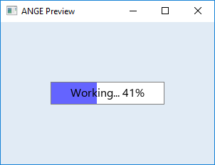
ProgressBar
Widget that displays progress bar. It can interact with your program via Callbacks (you can get ProgressBarUpdateEvent on every tick or on complete - check ProgressBarFlags ) or by polling methods.
float val = 0.0f;
ProgressBar progbar(
	&mainWindow,
	{ {150, 100}, {160, 32},
	ProgressBarFlags::PrecentageInfo | ProgressBarFlags::AutoUpdate | Anchor::HorizontalCenter | Anchor::VerticalCenter},
	theme,
	L"Working... ", //Text that will be displayed along percentage info when PercentageInfo flag is set.
	30.0f //Max value
);
progbar.SetToObserve(&val);
progbar.SetFlags(progbar.GetFlags() | ProgressBarFlags::InvokeCallback);
	progbar.SetCallback([](Event* ev)->bool{
		ProgressBarUpdateEvent* pbue = (ProgressBarUpdateEvent*)ev;
		std::cout<<"Work done! ["<GetRatio()<<"%]";
		return true;
	});
Checkbox
Widget that displays checkbox. It can interact with your program via Callbacks (you can get CheckboxChange event) or by polling methods.
	Checkbox boxes[3] = {
		Checkbox(&mainWindow, {{100, 100}, {22, 22}}, theme),
		Checkbox(&mainWindow, {{150, 100}, {22, 22}}, theme),
		Checkbox(&mainWindow, {{200, 100}, {22, 22}}, theme)
	};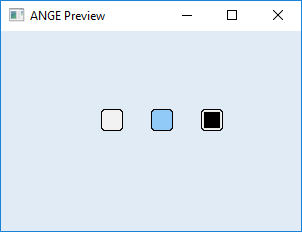
if (boxes[1].GetState() == true){
	mainWindow.Close();
}
Ratio
Widget that displays ratio widget. It can interact with your program via Callbacks (you can get RatioChange event) or by polling methods.
	Ratio ratio(&mainWindow);
	ratio.AddOption(341,	{ {100, 100}, {22, 22} }, theme);
	ratio.AddOption(5,		{ {150, 100}, {22, 22} }, theme);
	ratio.AddOption(7301,	{ {200, 100}, {22, 22} }, theme);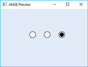
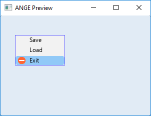
ContextMenu
Widget that displays context menu. Użycie tego widżetu wymusza użycie widżetu pomocniczego - zazwyczaj jest to SimpleButton, ale nic nie stoi na przeszkodzie by był to np. SimpleInput (i żeby wtedy działał jako menu kontekstowe dla tej kontrolki) etc.
ContextMenu cmenu(&mainWindow, {100, 0}, theme);
cmenu.AddItem(L"Save");
cmenu.AddItem(L"Load");
cmenu.AddDivider({ 0,0,0,0 });
//We want to handle option below so we will store pointer to this option.
auto exitSelection = cmenu.AddItem(L"Exit", &minusTex);
//And finally we disable our widget (to make it invisible for now).
cmenu.DisableWidget();
//We want it to be the exact size of the main window (to cover entire window space) - because it will be "global" menu.
SimpleButton windowBtn(&mainWindow, { {0,0}, {0,0}, ResizePolicy::AutoFill | Anchor::Left | Anchor::Right },
	SimpleButtonTheme{ {{0,0,0,0}, {0,0,0,0}}, {{0,0,0,0}, {0,0,0,0}}, {{0,0,0,0}, {0,0,0,0}}, {0,0} } //Make it invisible
);
//Show context menu after clicking on our global button.
windowBtn.SetCallback([&cmenu](Event* ev){
		if (ev->GetEventType() == EventType::MouseClick)
		{
			MouseClickEvent* mce = (MouseClickEvent*)ev;
			if (mce->GetAction() == 0 && mce->GetButton() == 1)
			{
				cmenu.SetPosition(mce->GetPosition()); //Do it in appriopriate place.
				cmenu.EnableWidget();
			}
		}
		return true;
	});

	//Handle context menu button
	exitSelection->SetCallback([&mainWindow](Event* ev){
		mainWindow.Close();
		return true;
	});
VScroller & Window
Under construction.